Color Matching in Bag Inspection: How to Check Shade Bands
A shade band is the signed pair — or trio — of swatches that marks the edge of acceptable colour. Everything else follows from it: the light source, the comparison method, the instrument, and whether a finding is a major or a minor. Without one, colour is a matter of opinion.
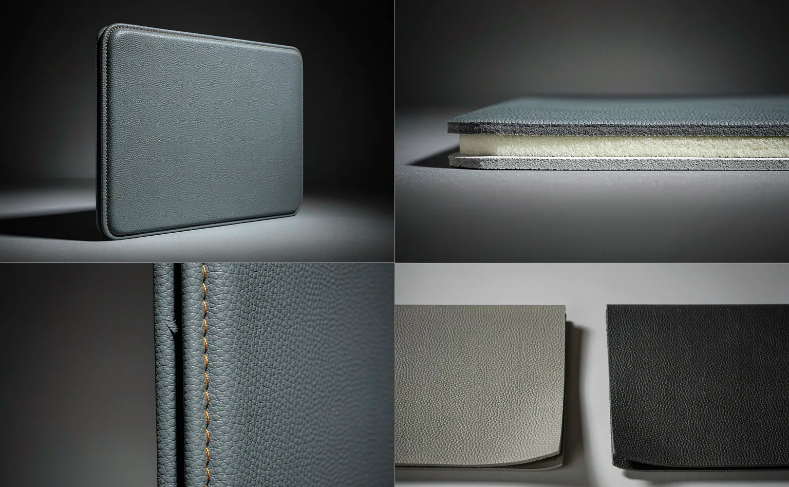
Agree the reference, the light source and the tolerance before the fabric is cut. Once those three exist, a colour argument becomes a comparison rather than a negotiation — and most findings resolve in minutes.
Colour causes more disputes on a bag programme than any other single attribute, and it is rarely because anybody did anything badly. It happens because colour is the one specification most often left unquantified. The drawing says "navy". Six people picture six shades of navy. The factory makes one of them, the buyer expected another, and both are telling the truth.
A bag makes this worse than a single-panel product. One unit may carry a shell, a lining, webbing binding, several pieces of hardware, thread, print, a label and a zipper tape — each dyed or finished by a different process, each capable of landing slightly off. A unit can pass every panel comparison individually and still look wrong assembled, because the eye reads the relationships between parts rather than the parts themselves.
Why Does Colour Go Wrong More Often Than Anything Else?
Four separate sources of variation stack up. Dye-lot variation is unavoidable in textile coloration and is usually the largest single contributor. Substrate variation changes how the same dye reads on a plain weave versus a twill, or on a coated versus an uncoated face. Finishing variation — heat, calendering, lamination — shifts appearance after dyeing. And finally environmental variation: light, humidity and time.
The important point for a buyer is that only one of these four is really controllable at reasonable expense: knowing the dye lot and keeping it together. Require the lot number to be recorded at cutting, require the units made from one lot to be kept together through packing, and require the number to appear in the inspection report. The rest is managed by tolerance rather than eliminated.
What Is a Shade Band, and Who Approves It?
A shade band is a set of physical swatches defining acceptable variation around an approved reference. Typically it consists of the reference itself plus a light limit and a dark limit, sometimes with additional limits for hue drift. A unit whose colour falls inside the band is acceptable; one outside it is not. Each swatch carries the same lot reference and each is signed or initialled.
Two practical requirements make the difference between a band that works and one that produces arguments. First, the band must be generated from the same material as the production fabric, not from a paper or card approximation. Second, there must be at least two complete sets: one with the mill and one with the buyer, cross-checked so they genuinely agree — comfortable twilight differences between two "identical" sets are common enough to be worth verifying.
Each card should carry its own identifiers — programme, colourway, generation date, and who signed it. Then when a dispute arrives twelve months later, everybody can tell which version of the standard was in force at the time the goods were made, rather than arguing from two different cards and assuming they are the same one.
Bands also need a stated number. "Slightly darker" is not enforceable. Many programmes grade the difference against a grey scale and require, say, grade 4 or better, which gives both sides something to read rather than feel. The number can be loose and still useful; absence of any number is not.
| Comparison being made | What is placed side by side | Acceptable difference | Failure seen most often |
|---|---|---|---|
| Panel to approved reference | Cut panel laid flat against the reference under the named light source | Inside the light and dark limit swatches | Comparing against the reference while it sits in daylight and the panel sits under a store lamp |
| Panel to panel within one unit | Front panel against the gusset, or the flap against the body | No visible difference at a stated viewing distance | Panels cut from different lots combined during closing |
| Soft trim to shell | Binding, webbing or tape against the shell it is sewn onto | Inside its own tolerance, which is often wider than the shell's | Webbing from a different dye lot used on an otherwise clean run |
| Print to the named colour reference | Printed mark against the colour reference cited in the artwork file | Inside the stated tolerance, checked after full cure | Checking before cure, when every reading looks wrong |
| Hardware finish to reference | Plated component against the approved plating sample | Inside the approved sample range | Two plating batches mixed in one assembly |
| Unit to unit in one carton | Several finished units side by side | No visible difference between neighbours | Units from different production days packed together |
Should Colour Be Approved on a Lab Dip or on Bulk Fabric?
Both, and the order matters. A lab dip is a small sample dyed to demonstrate a formulation; it establishes that a recipe exists. Bulk fabric is dyed on a completely different scale, with different liquor ratios, times and temperatures, and it routinely differs from the dip. Approving only the dip means the first bulk lot is the first time anyone sees the production colour.
The workable practice is to approve the dip as a direction, require a bulk shade continuity sample from the actual dye lot before cutting, and generate the reference cards from that bulk sample. It adds days to the front of a programme and removes the single most expensive category of surprise in it. Where a programme genuinely cannot wait, at least require a continuity sample from each subsequent lot — that is much of the benefit for a fraction of the time.
Never approve a colour from a screen. Whatever the display is calibrated to, it is not calibrated to the dye house's equipment, the inspector's lamp or the retailer's lighting. A screen is fine for agreeing layout and useless for agreeing colour, and every hour spent trying to make it work is an hour lost.
What Light Source Should the Comparison Be Made Under?
Whichever one you named in the clause, and at least two if you want the result to hold up in a shop. Fabric dyed to match under daylight can read quite different under store lighting. Insisting on one source is how a visibly mismatched unit passes inspection and later gets returned by a retailer who looked at it under their own lighting.
| Light source | What it represents | What it reveals | Typical use |
|---|---|---|---|
| D65 | Average daylight, roughly 6500 K | The baseline appearance most commercial references assume | Primary comparison in almost every programme |
| TL84 or CWF | Shop and supermarket fluorescent lighting, around 4000 K | Differences the customer will see at the point of sale | Second comparison where the goods are sold in store |
| Illuminant A | Domestic tungsten lighting, around 2856 K | Shifts that only appear in warm indoor light | Used where the product is used at home rather than sold bright |
| UV component | Ultraviolet present in daylight | Fluorescent brighteners, contamination and some coating faults | Checked where optical brightening agents may be present |

Nobody expects a small inspection room to house a full light booth installation, and most do not. What is reasonable to require is a defined place, a defined lamp, a stated viewing geometry — samples placed side by side flat, viewed at roughly 45 degrees rather than held up — and the requirement recorded in the checklist. Repeatability matters more than sophistication.
How Does Metamerism Ruin a Matched Set?
Metamerism is the case where two materials match under one light source and not under another. It happens because their colour was produced by different pigment or dye systems that happen to reflect identically in one region of the spectrum and differently elsewhere. On a bag it is common between a piece-dyed textile and a solution-dyed trim, or between a textile panel and a printed or coated surface.
The only practical defence is to compare under two or more sources at approval stage and require both to pass. A reference that matches under D65 and diverges under shop lighting should not have been signed off, whatever the instrumental reading said. This is the strongest reason for checking more than one source rather than investing in a better instrument.
Should a Grey Scale or a Spectrophotometer Decide?
They answer different questions, and a mature programme uses the eye first and the instrument second. The eye decides whether anything is wrong; the instrument quantifies how far off it is and lets you record the number rather than the impression. A grey scale is the pragmatic middle ground: a physical reference for how large a difference is, graded in steps, usable without power, and understood on both sides of the conversation.
A spectrophotometer gives you repeatable numbers and is genuinely valuable for a repeat programme — it turns colour approval into a recorded value rather than a held opinion, which matters enormously when the same colourway is being made twelve months later. It is also useless without a reference: the instrument will happily report the difference between two things when nobody agreed which one was correct.
Whatever the tool, results used as formal evidence should come from a laboratory working to ISO/IEC 17025. A hand-held reading taken on a table is excellent for managing a run and weak for settling a contract dispute, and knowing which situation you are in saves a great deal of wasted effort.
How Many Units Are Compared, and Against What?
Every unit in the sample, because shade is a per-unit attribute. A drawing of 50 units from a 500-piece lot leads to all 50 being laid next to each other, not merely compared individually with the reference. The assembled comparison is what catches the mixed-day problem: two units each acceptable against the standard can be unacceptable beside each other.
Compare like with like. Put the panel against the reference and put the finished unit against another finished unit from the same carton. Comparing a cut panel to a sewn unit introduces construction variables — tension, seam shadow, a lining reading through — and the disagreement those cause is not about colour at all.
How Should a Colour Finding Be Classed?
Class it by consequence, which nearly always means: who notices, and what do they do about it. A difference a customer sees on a shelf and would put the bag back for — and especially anything affecting a matched set sold together — is a major. A difference visible only under close examination or only under a source other than the one specified is generally a minor, and a difference visible only inside the lining usually is too.
Colour very rarely belongs in the critical class. It becomes critical when the colour carries a compliance meaning: a specified safety colour, a warning marking whose colour is regulated, or a material finish whose appearance is part of a restriction. Keep those explicitly in the critical list rather than leaving them to interpretation.
What Should Be Written Into the Colour Clause?
Nine items the colour clause has to name
- The reference number and lot number of the approved reference swatch.
- The light limit and dark limit swatches, or another stated tolerance.
- The light source — and preferably two — under which the comparison is made.
- The viewing geometry: samples flat, the same surface, the same session.
- Which components have their own comparison and which roll up to the shell.
- The requirement that dye lot numbers be recorded at cutting and kept together through packing.
- The unit-to-unit comparison across a carton, not just against the reference.
- The defect class for each kind of difference, agreed in advance.
- How the reference set is stored, renewed, and re-verified after a stated period.
That last item is the one every programme forgets. Fabric references age: they yellow, they fade, they pick up handling soil. A reference set held for three years is no longer the standard it once was, and comparing against it quietly drifts the whole programme. Renew them on a stated cycle and keep the retired set identifiable so history can still be read.

How Does Colour Hold Across a Repeat Order?
This is where a documented colour discipline pays for itself. On a repeat, the reference, the lot record, the tolerance and the instrument reading all still exist, so the twelfth production runs to the same numbers as the first. Without them, the repeat relies on someone remembering what the first one looked like, which is roughly as reliable as it sounds.
Ask for the lot number used on the previous order and specify it where the mill can supply the same one. Where a lot has run out, ask for a new reference pairing — the new lot versus the old reference — and approve the pair rather than accepting a written assurance that nothing changed. Bulk production runs 35-50 days from written sample approval, and that comparison belongs before any of it begins.
Storage expectations belong in the same clause. Textiles exposed to light over months move, and a bag held in a bright warehouse or shipped through heat will not read the same on arrival as it did at inspection. Where a market is sensitive, require a stated fastness performance from the laboratory rather than hoping the look survives the journey.
Approve the reference set before the fabric is cut
Send the colourway and target quantities — reference cards, dye lot control and the light-source requirement come back written into the checklist.
Frequently Asked Questions
How many light sources should a colour check use?
At least two. One source is enough to sign off; two are needed to catch metamerism, which is the mismatch that reaches the shelf rather than the report.
Can a colour difference be checked without a light booth?
Yes, provided the source is named and repeatable — a defined lamp in a defined place, with the samples viewed flat and side by side. Repeatability matters more than the equipment.
Who should hold the approved reference set?
Both parties, and the two sets should be cross-checked so they agree. Keep a record of who holds each numbered set and renew them on a stated cycle.
How long do reference swatches last?
Longer than most programmes assume and shorter than anybody hopes. Set a renewal period in the clause rather than discovering the problem during a dispute.
Is a unit-to-unit difference a defect if both units match the reference?
Frequently yes. Matched sets are sold together, so two units that differ visibly from each other can each pass individually and still be rejected as a pair.
Should the lining be held to the same tolerance as the shell?
Usually a wider one. It is seen less and seen differently. Say so explicitly rather than letting the inspector decide on the day.
What is a grey scale used for?
Grading how large a colour difference is, in steps, using a physical reference. It turns "slightly off" into a number both parties can read.
Does a spectrophotometer replace visual comparison?
No. It quantifies a difference the eye has already found, and records it. It does not decide whether the difference is acceptable without an agreed tolerance.
Why do trim and shell colours drift apart on a long run?
Because they usually come from different dye lots with different lead times. Bind the trim lot to the shell lot at approval, or the relationship will move during the run.
How should a colour finding be photographed?
Flat, side by side with the reference, under the named source, in the same frame. A photograph of one component alone proves nothing about colour.
Can colour be a critical defect?
Rarely, but yes where colour carries a compliance meaning — a regulated safety colour or a required warning marking. Name those in the critical list.
What version of the reference did the inspector use?
The report must state the reference number and lot number. Without it there is no way to know which standard the comparison was made against.
Should printed colour be judged before or after curing?
After full cure. Readings taken too early are simply wrong, and the clause should say how long cure runs before the comparison is made.
People Also Ask
What is a shade band in garment and bag inspection?
A signed set of physical swatches marking the acceptable range around an approved colour — typically a reference with a light limit and a dark limit.
How do inspectors check colour matching?
By laying the production material flat beside the approved reference under a named light source, and comparing unit to unit across the carton as well.
What causes colour mismatch in production?
Dye-lot variation above all, then substrate differences, finishing shifts and environmental exposure. Only the first is really controllable.
What light is used to check fabric colour?
D65 daylight is the common baseline, usually paired with a store lighting source around 4000 K to catch metamerism before it reaches the shelf.
What is metamerism and why does it matter?
Two materials matching under one light source and not another. It matters because the mismatch is invisible in the inspection room and obvious in store.
Sources and further reading
Every figure on this page is either our own programme data or attributed below. Open the originals before you write them into a specification.
- AATCC technical manual — colourfastness and appearance test methodsAmerican Association of Textile Chemists and Colorists
- ISO 2859-1:1999 Sampling procedures for inspection by attributesInternational Organization for Standardization
- ISO/IEC 17025 — Competence of testing and calibration laboratoriesInternational Organization for Standardization